Track a Virus: Open Source COVID-19 Dashboard
We live in desperate times. And more than ever we need to make decisions based on hard data and collaborate with each other.
So in the spirit of that, I've released an open source COVID-19 Dashboard.
- You can play with it here.
- And see its source code on GitHub.
- It's written with React, TypeScript, and MobX
Its key features are:
- Comparison between different countries
- Ability to see daily changes in a number of cases and deaths
- Snapshot of the data across the whole world
- And the ambition is to provide the most comprehensive COVID-19 dashboard, so your code contributions are more than welcome :-)
- Data by the John Hopkins university
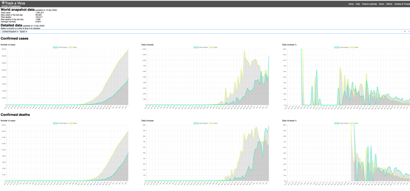 {: .center-image }
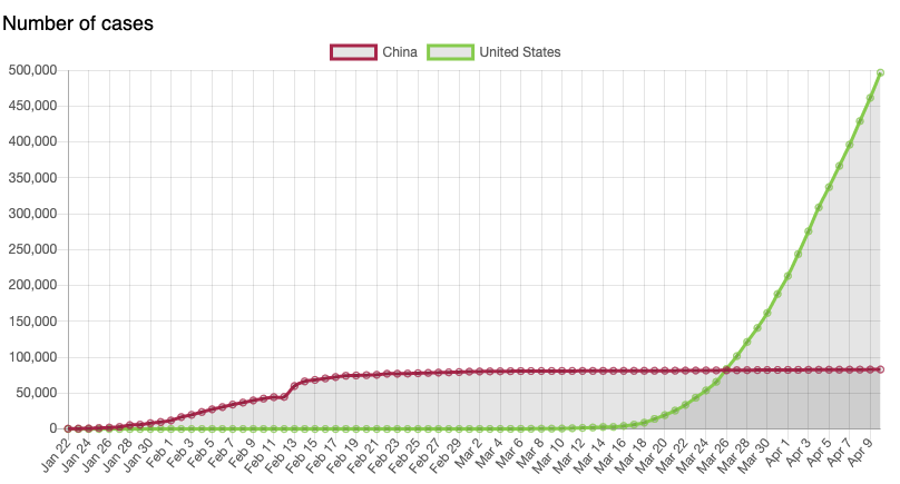
Country comparison
You can easily compare countries and see that while China flattened the curve in February a number of infections keeps going up.
 {: .center-image }
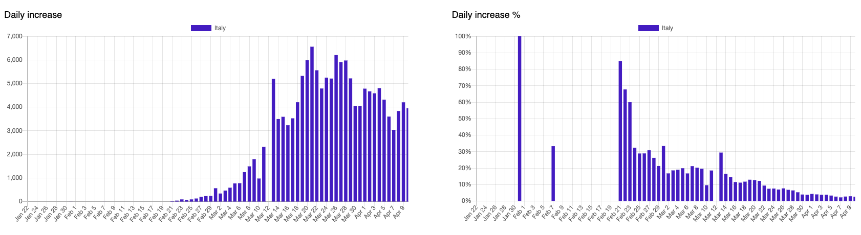
Daily increase
The dashboard also gives positive news and says that the peak of the epidemic has passed in Italy.
 {: .center-image }
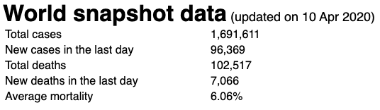
World snapshot
Finally, you can see a quick snapshot of the data aggregated across the entire world.
 {: .center-image }
Why another dashboard?
You may wonder why another dashboard. It is true, there are a number of dashboards available. In particular, the one by Oleksii Trekhleb looks similar. There are a few key aspects about this one:
- Focus on trends, country comparisons, and aggregated global data
- From the day 1 the dashboard includes daily increases for a number of cases and deaths
- There is a whole roadmap of the new features
- There are plans to add a growth rate
- Mortality figures
- and so on
- Our tech stack and architecture enables developers easily build new features:
- React, TypeScript, Chart.js - is a fairly standard stack
- I've focused on the code quality to make sure it's easy to navigate around the code and add new functionality
- I've also provided contribution guidelines that explains the architecture for people who wants to help with the project
- It provides a whole tutorial on how to write a new dashboard component
Of course, it is not perfect
- There are a number of thing which needs to be fixed or added
- For example, the percentage increase chart above may not accurately represents the trends. But there's already a plan to add a growth rate which could be better it.
- That's just the beginning and more features are coming out next week.
- And development can go faster if you join the project :-).
Let's try to flatten the curve together
Interested? Let's work on it together!
The opinions expressed herein are my own personal opinions and do not represent my employer's view in any way. My personal thoughts tend to change, hence the articles in this blog might not provide an accurate reflection of my present standpoint.
© Mike Borozdin